
How to Add a Call to Action (CTA) Button to a Page
Introduction
The Call to Action (CTA) Button Widget allows you to add an interactive button to pages on your eDirectory website. This button can guide visitors toward a specific action, such as contacting your business, making a reservation, accessing an external system, or visiting another page.
You can customize the button's style, alignment, and label according to the purpose of the page.
Step 1: Open the Page Editor
To add a Call to Action button to a page, first access the Page Editor and select the page where you want the button to appear.
1.1. Access the Page Editor
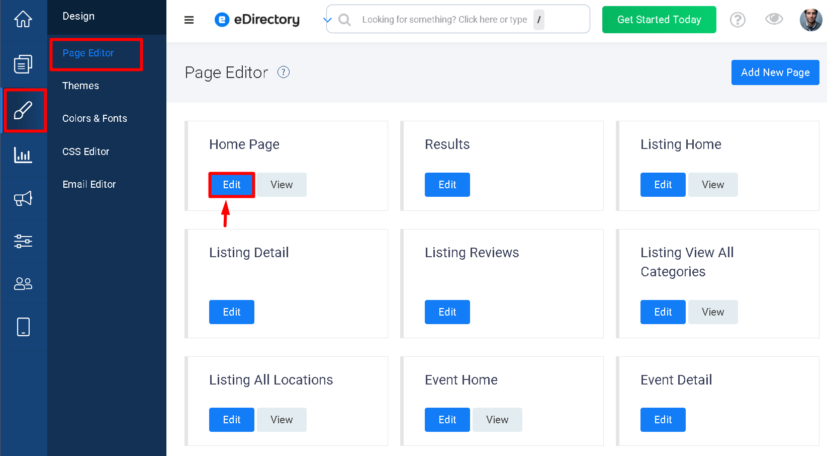
Navigate to Design > Page Editor.
1.2. Select the Page
Locate the page where you want to add the Call to Action button and click Edit.
The Page Editor will open, allowing you to customize the content and layout of the selected page.
Step 2: Add the Call to Action Button Widget
After opening the desired page, add the Call to Action Button widget to the section where you want the button to appear.
2.1. Add a Widget
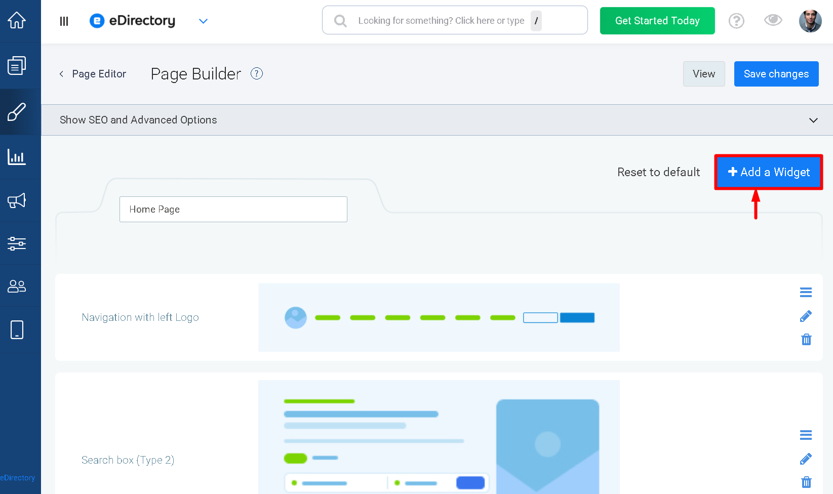
In the Page Editor, click Add a Widget.
2.2. Select the Call to Action Button Widget
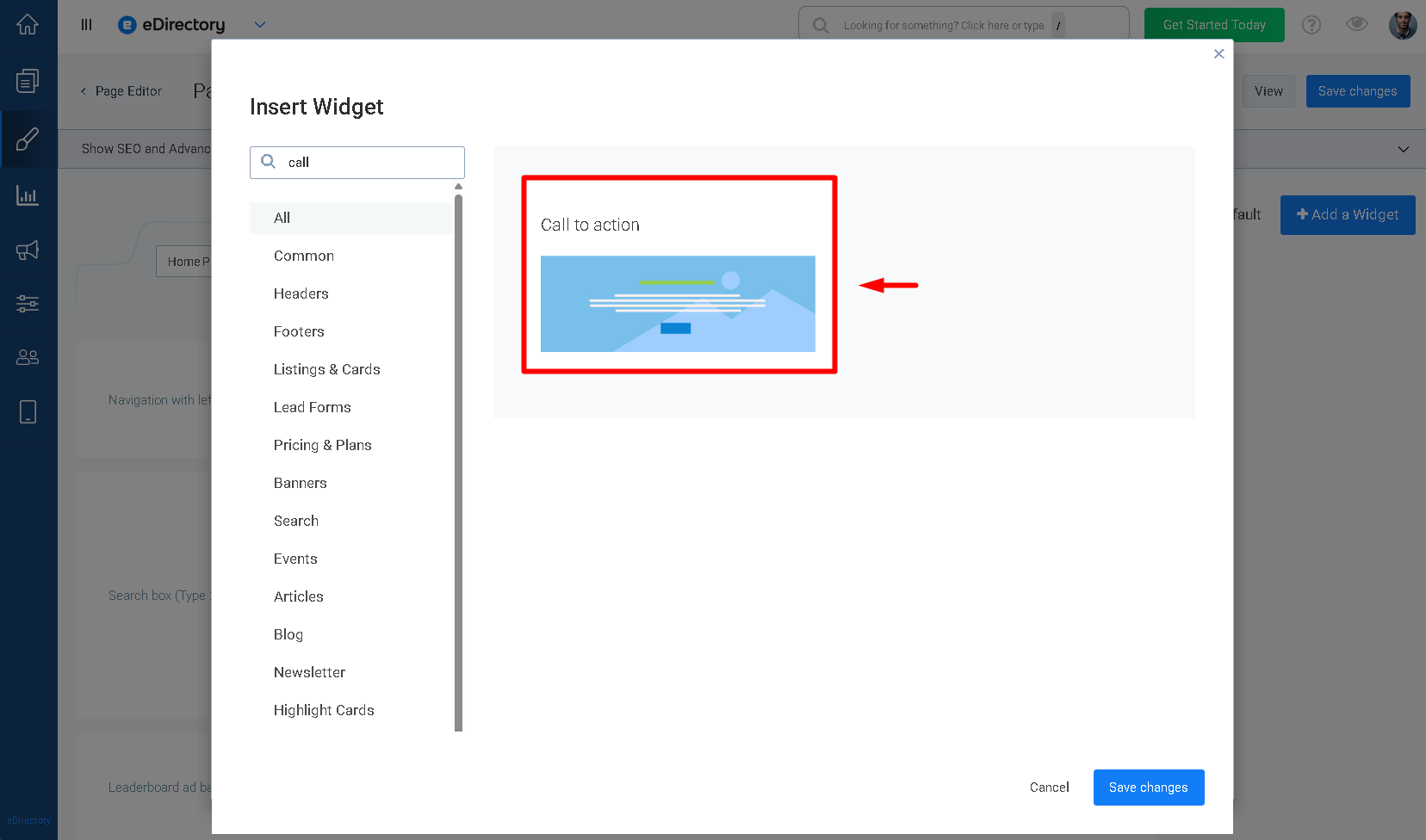
- Search for and select the Call to Action button widget.
- The widget will be added to the page and its configuration options will become available.
2.3. Edit the widget
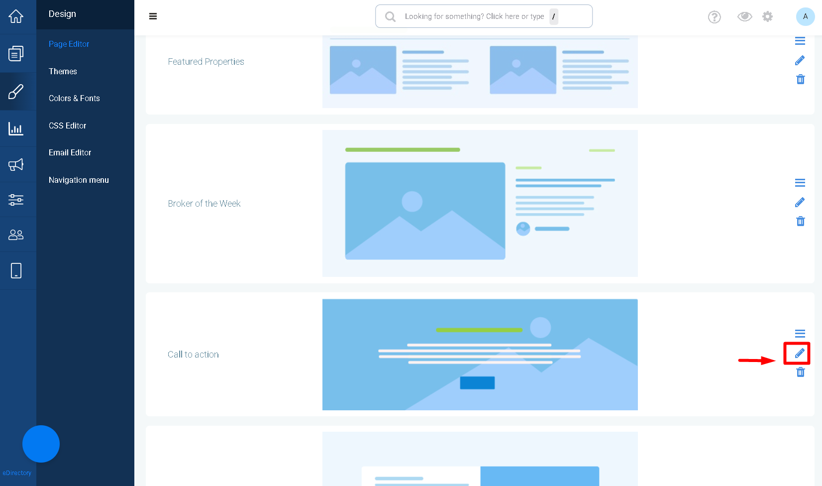
The widget will be added to you page. Click on the pencil icon to edit it.
Step 3: Configure the Call to Action Button Widget
After adding the widget, configure the available options to customize the appearance and functionality of the Call to Action section.
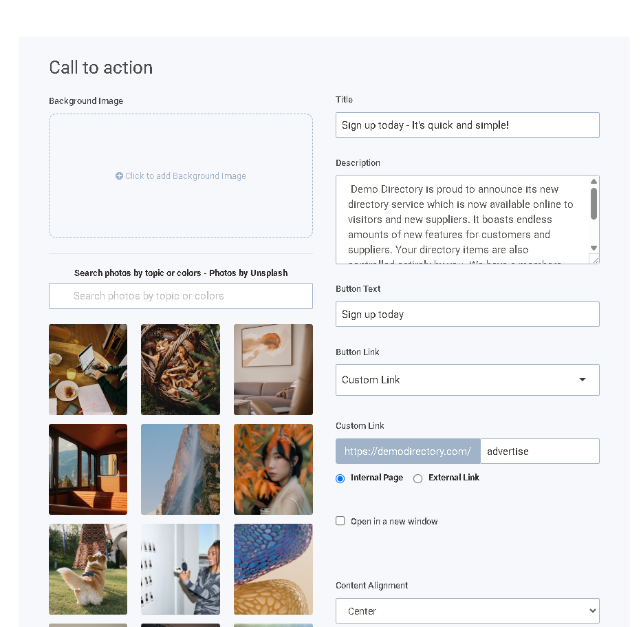
3.1. Add a Background Image
The Background Image option allows you to add an image that will be displayed as the background of the Call to Action section.
Click Click to add Background Image to upload an image or select one from the available options.
You can also search for images by topic or color using the Search photos by topic or colors field. The widget provides images through Unsplash.
Tip: We recommend using an image that is 1920 x 580 px to cover the entire site and provide a consistent background.
3.2. Add a Title
Enter the title that you want to display in the Call to Action section.
The title should clearly communicate the purpose of the call to action and attract visitors' attention.
For example: Sign up today - It's quick and simple!
3.3. Add a Description
Use the Description field to add supporting text below the title.
You can use this field to provide additional information or encourage visitors to take the desired action.
For example: Contact us today to learn more about our services.
3.4. Define the Button Text
Enter the text that will be displayed on the Call to Action button.
For example: Sign up today
The button text should clearly indicate the action visitors will take when they click the button.
3.5. Configure the Button Link
Use the Button Link options to define where visitors will be directed when they click the button.
Select the appropriate link option and provide the destination according to your needs.
When using a Custom Link, enter the destination in the Custom Link field.
You can choose whether the link is an:
- Internal Page – directs visitors to a page within your website.
- External Link – directs visitors to a page on another website.
3.6. Open the Link in a New Window
Enable Open in a new window if you want the destination page to open in a new browser tab or window when visitors click the button.
Leave this option disabled if you want the destination to open in the current browser tab.
3.7. Set the Content Alignment
Use the Content Alignment option to determine how the title, description, and button are positioned within the Call to Action section.
Select the desired alignment from the available options.
For example, you can select Center to display the content in the center of the section.
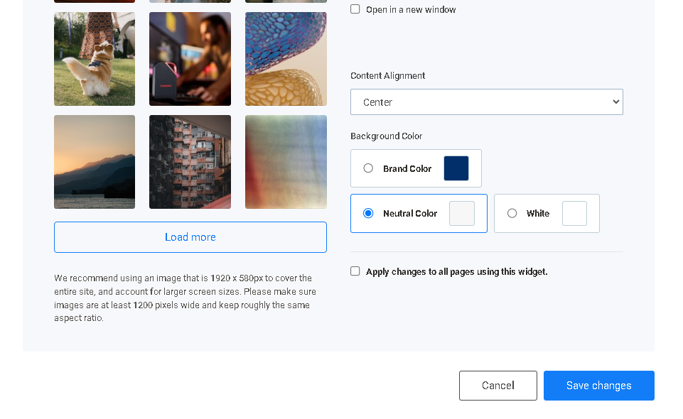
3.8. Choose the Background Color
The Background Color option allows you to select the background color of the Call to Action section when configuring its appearance.
The available options include:
- Brand Color – uses your website's brand color.
- Neutral Color – uses the neutral color available in your website's design.
- White – uses a white background.
Select the option that best matches the design of your page and the background image, if one is being used.
3.9. Apply Changes to All Pages Using This Widget
Enable Apply changes to all pages using this widget if you want the configuration changes to be applied to every page where this same widget is being used.
Leave this option disabled if you want the changes to apply only to the current page.
Step 4: Save the Widget and Page
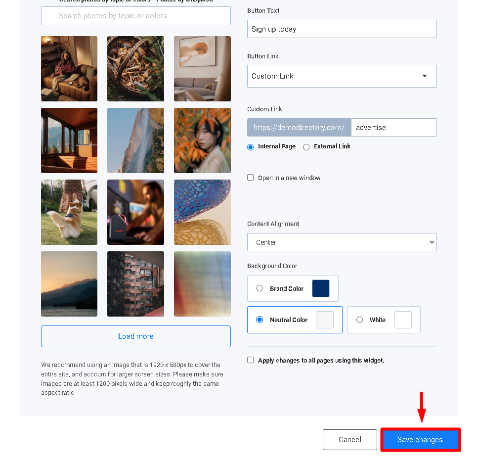
After configuring the Call to Action button, save the widget and the page to apply your changes.
4.1. Save the Widget
Save the Call to Action button widget after completing its configuration.
4.2. Save the Page
Save the changes made to the page in the Page Editor.
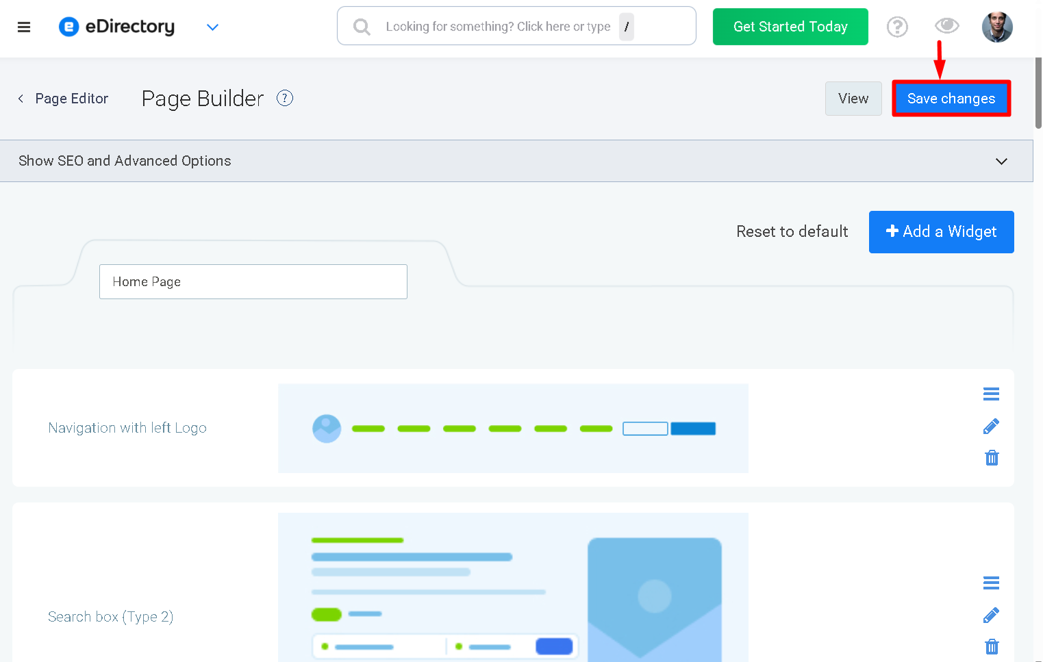
The Call to Action button will now be displayed on the page in the location where you added the widget.
Step 5: View the Call to Action Button
After saving the page, open the corresponding page on your website to verify the button.
The button will be displayed according to the style, alignment, and label configured in the widget.
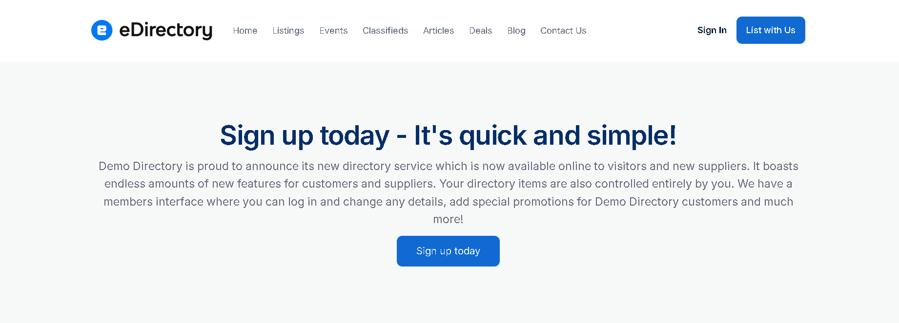
When visitors click the button, they will be directed to the destination URL configured for the widget.
Note: If you want to add a Call to Action button to a Listing Template and allow each listing to have its own destination URL, refer to Listing Template: Call to Action Widget
Conclusion
The Call to Action Button Widget allows you to add an interactive button to your pages and guide visitors toward a specific action.
You can customize the button's style, alignment, label, and destination URL to match the purpose of the page and the action you want visitors to take.
One difference from the Listing Template article is intentional here: I removed “Required”, because in the Page Editor the CTA isn't a field that sponsors complete on individual listings. Instead, the Page Editor CTA is configured directly by the Site Manager, including its destination URL.